Bravura Solutions required a unified approach to digital product design across its global teams. As the company expanded its suite of financial products and platforms, it became increasingly important to ensure visual and functional consistency. The solution was the creation of the Bravura Design System — a centralised library of reusable components, design standards, and implementation guidelines.
The design system aimed to align cross-functional teams, reduce duplication of effort, and deliver a more cohesive user experience across all touchpoints.
The Challenge
As Bravura’s digital products evolved, inconsistencies began to emerge in the use of UI components, typography, branding, and interaction patterns. These inconsistencies increased the complexity of product development and made it harder for teams to deliver a seamless user experience.
The team identified the need for a scalable design framework that would support consistent, efficient design and development workflows across multiple platforms and regions.
The Solution
The Bravura Design System was developed as a comprehensive toolkit that provides a shared language for designers and developers. It includes everything needed to build, scale, and maintain cohesive digital products.
Core Elements of the Design System
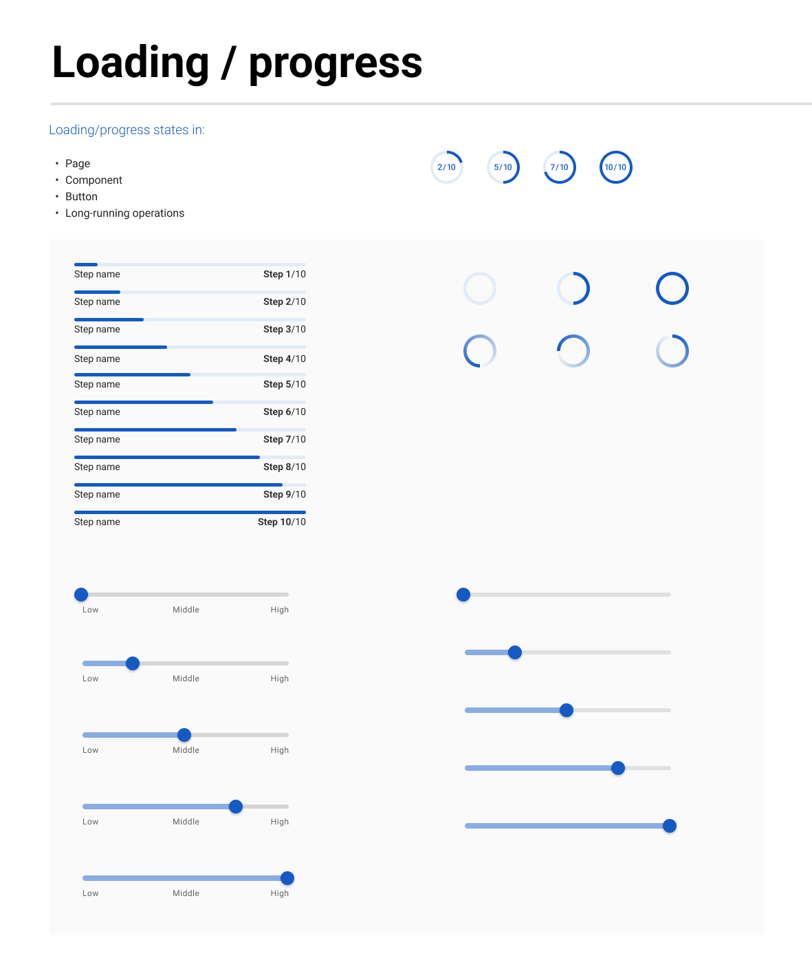
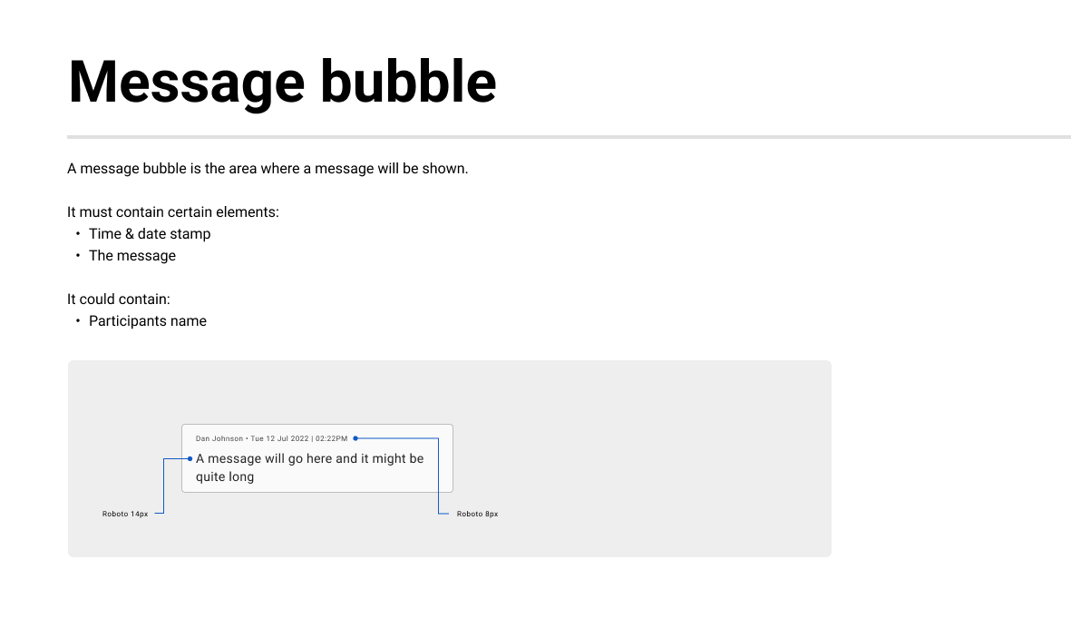
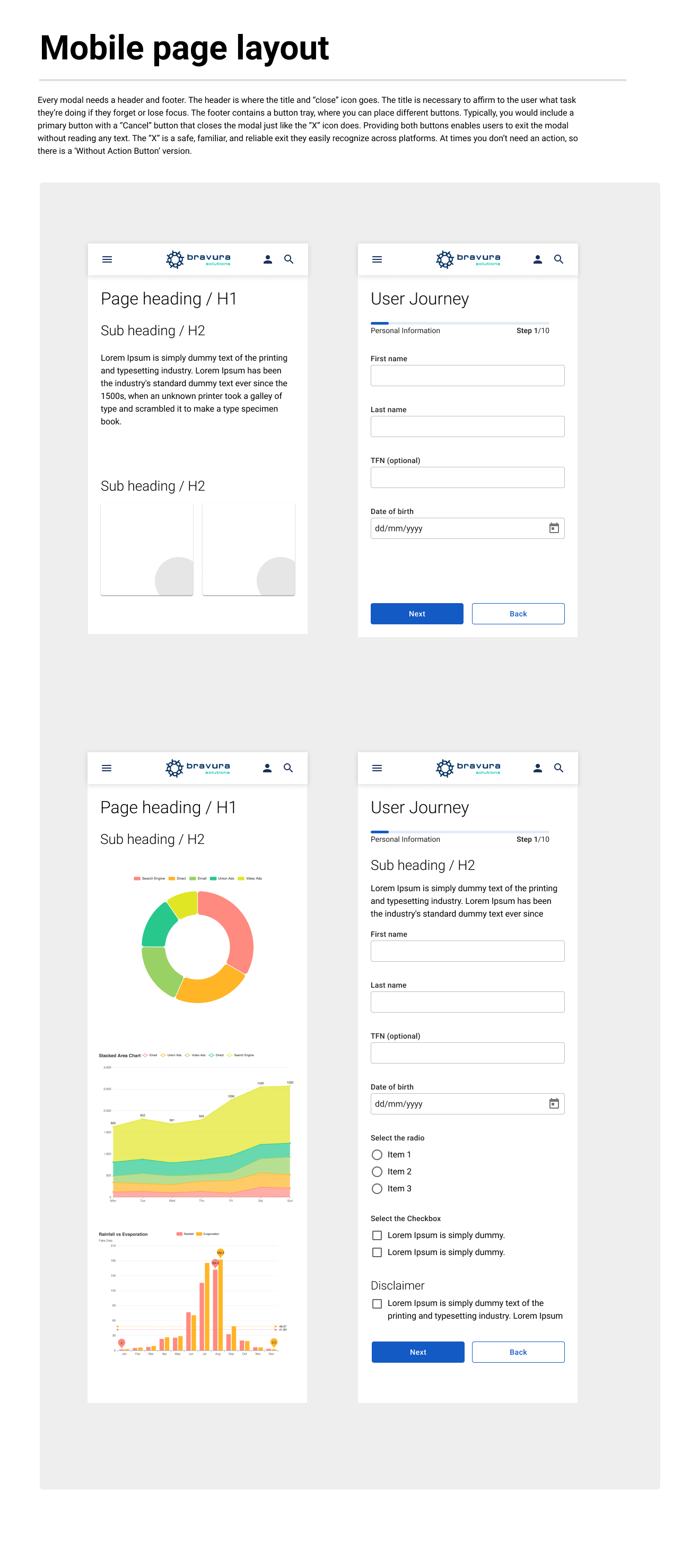
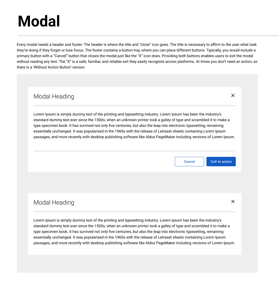
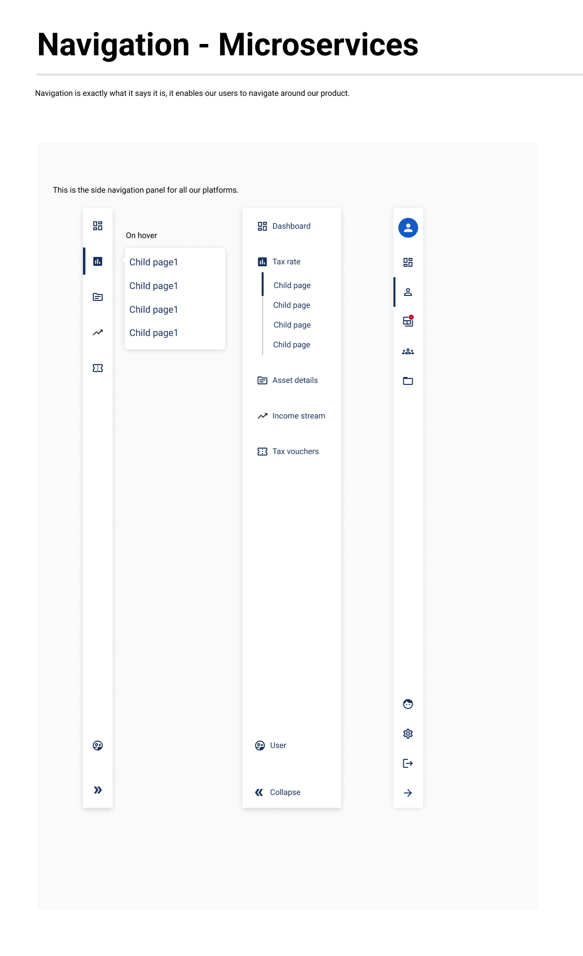
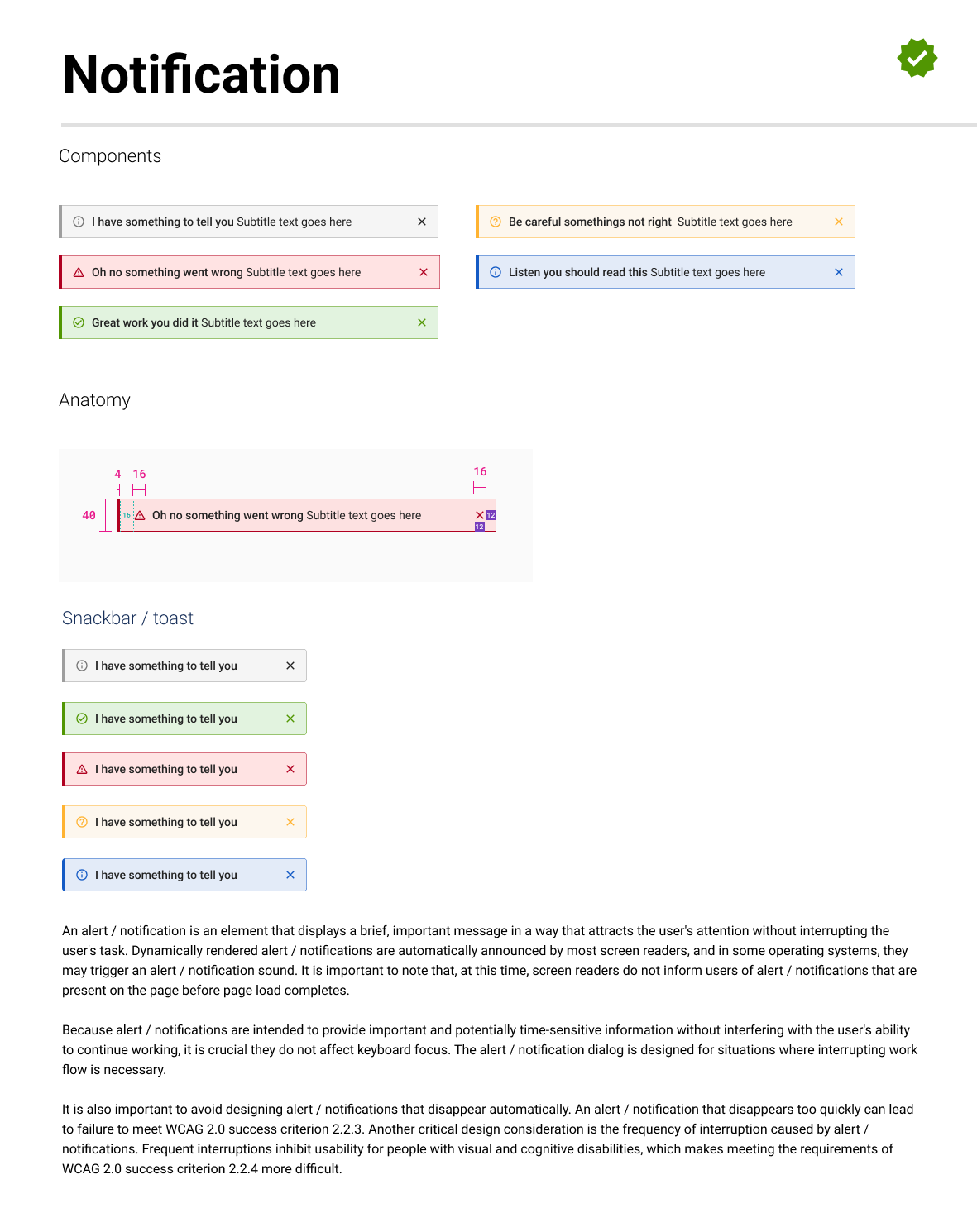
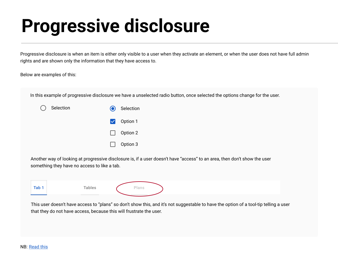
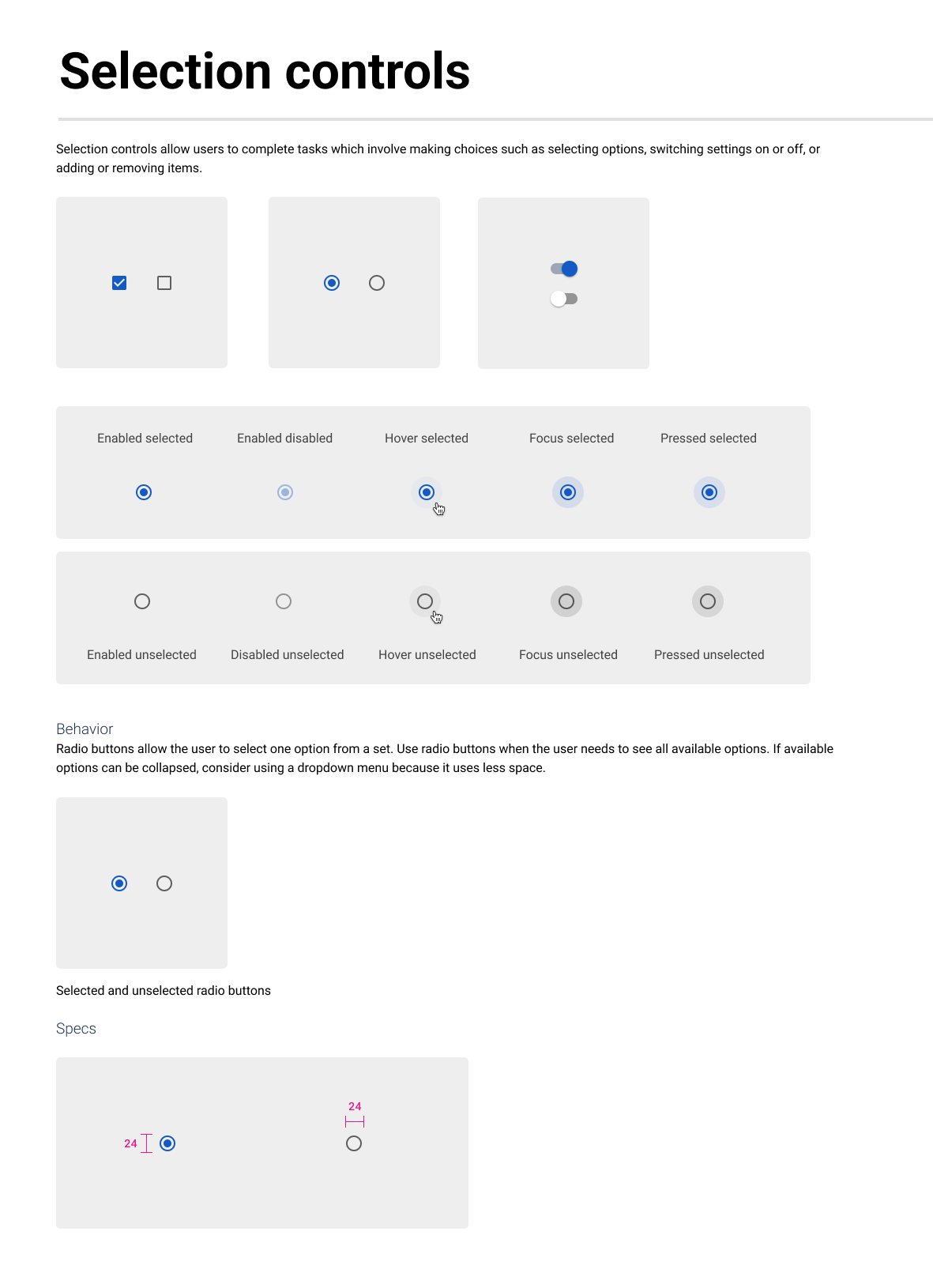
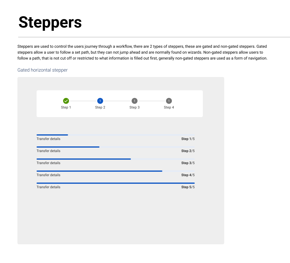
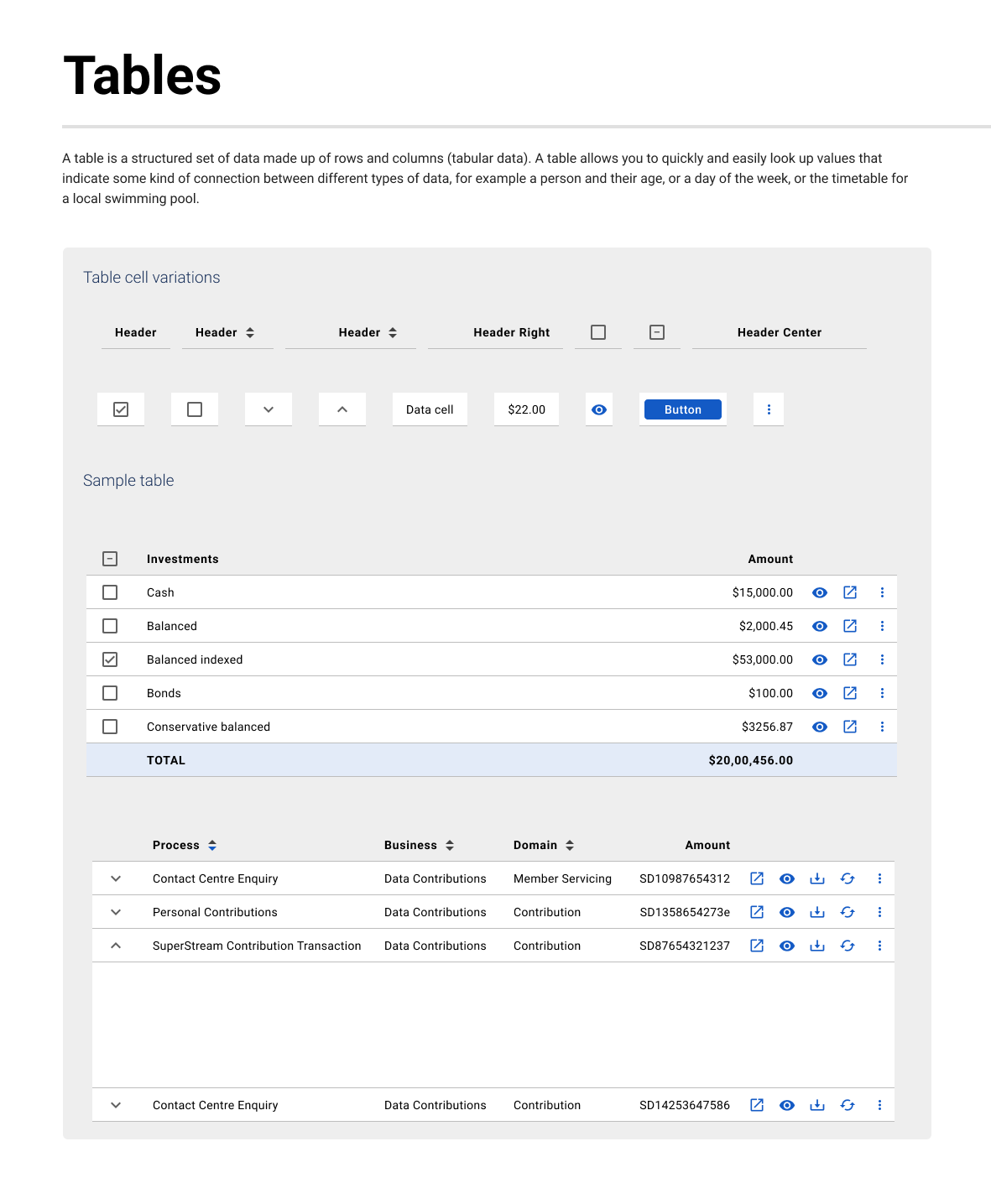
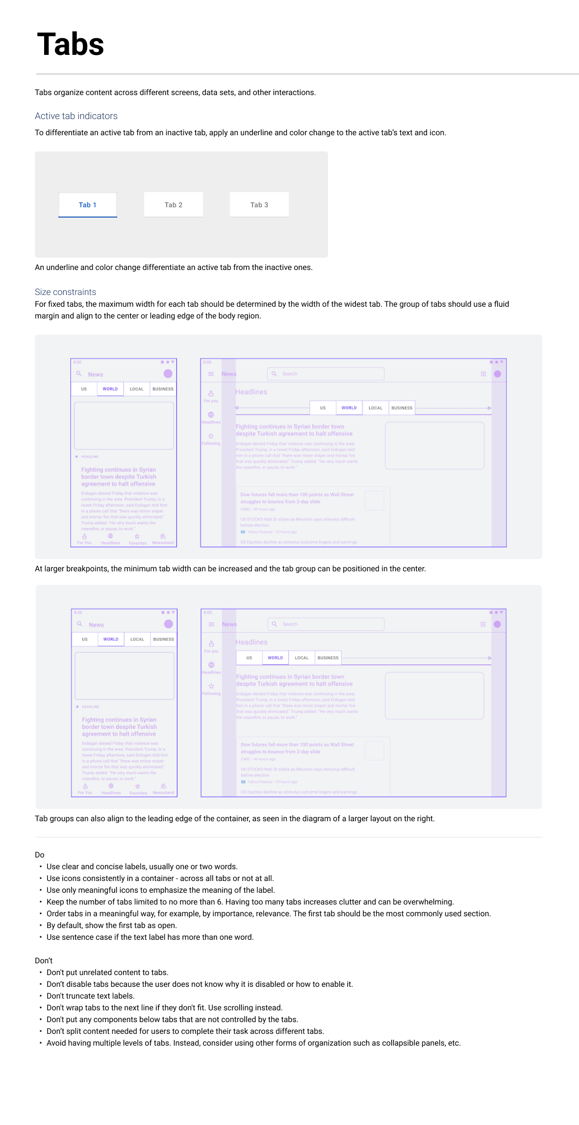
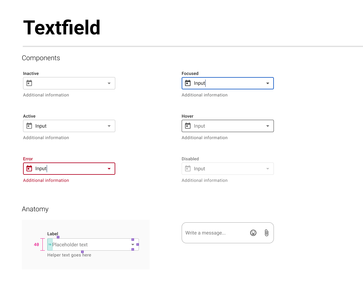
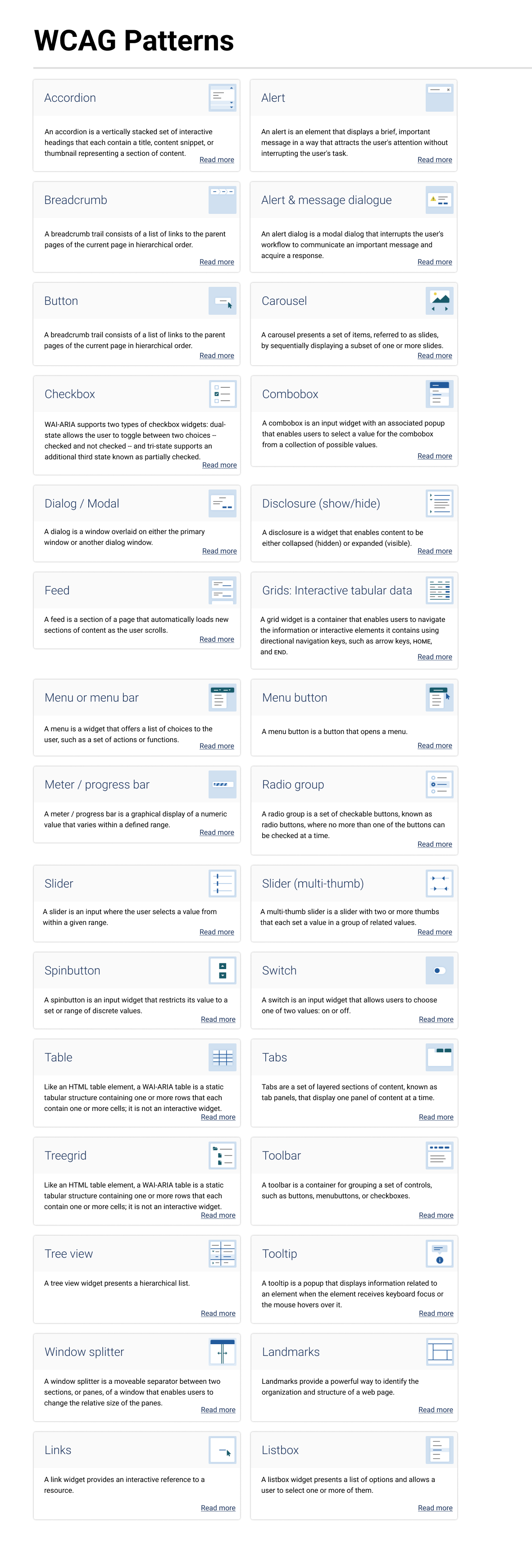
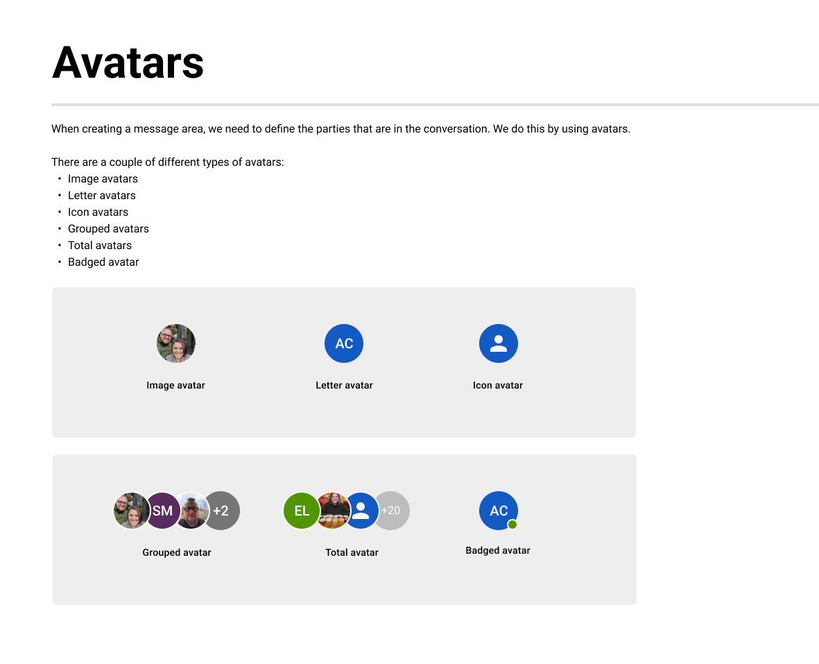
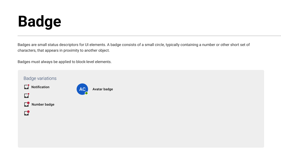
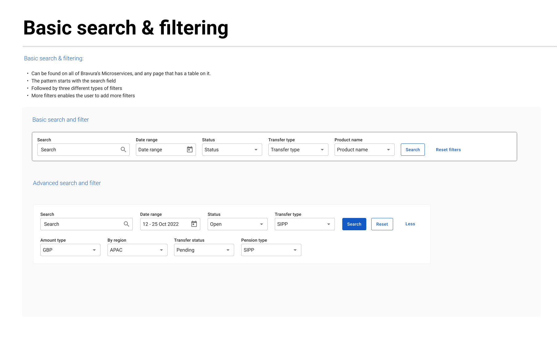
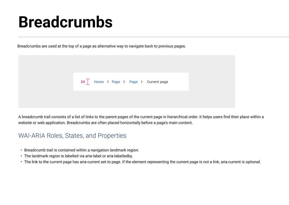
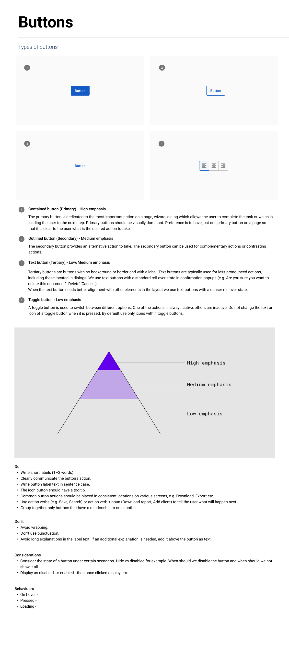
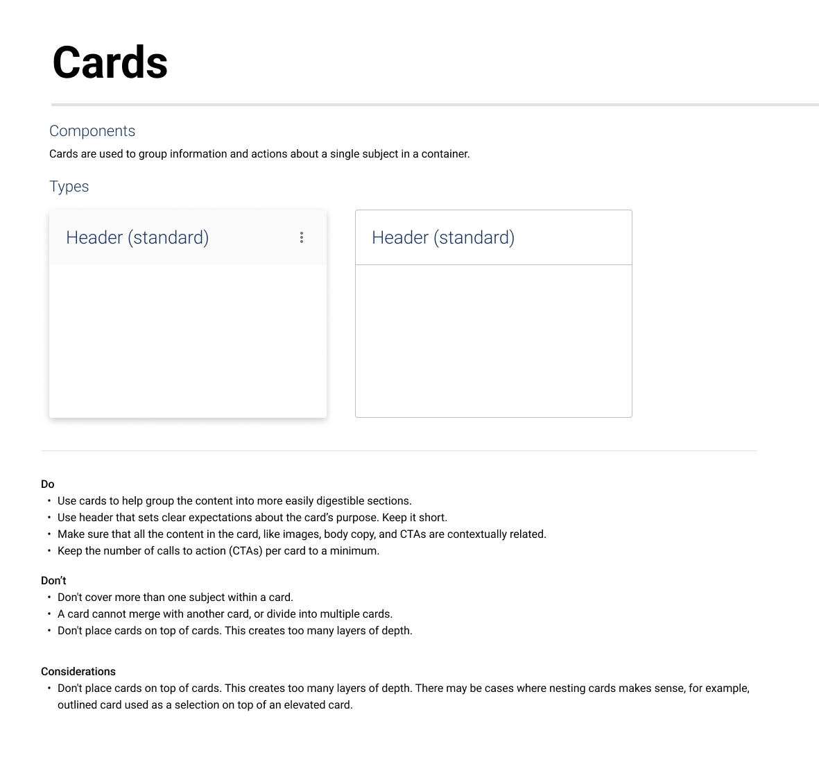
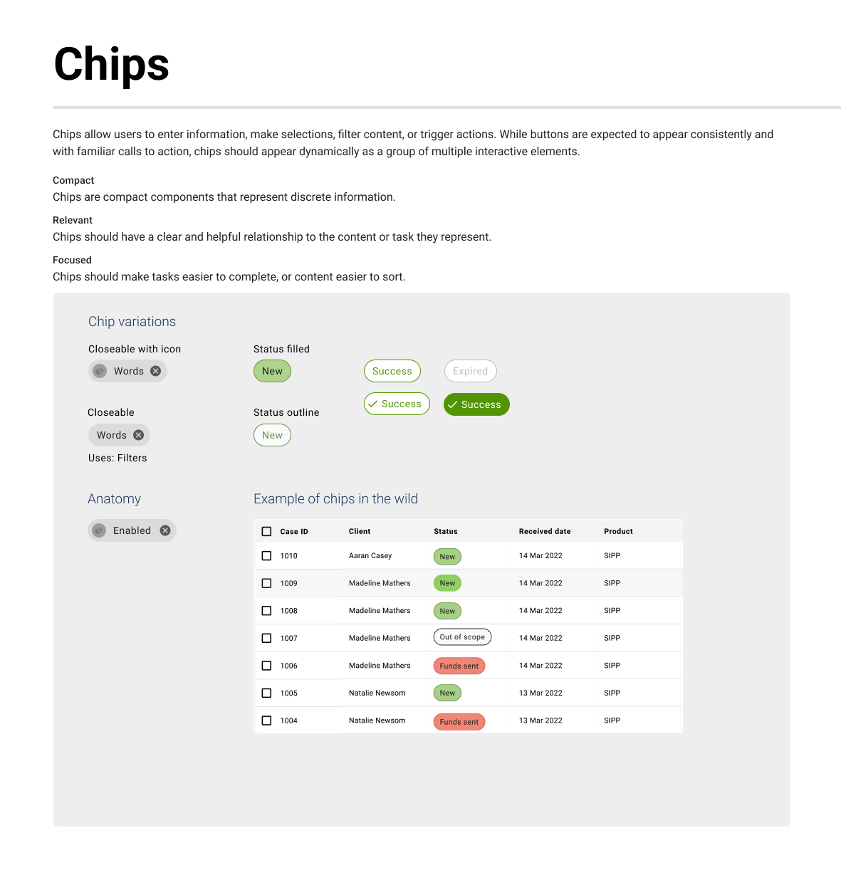
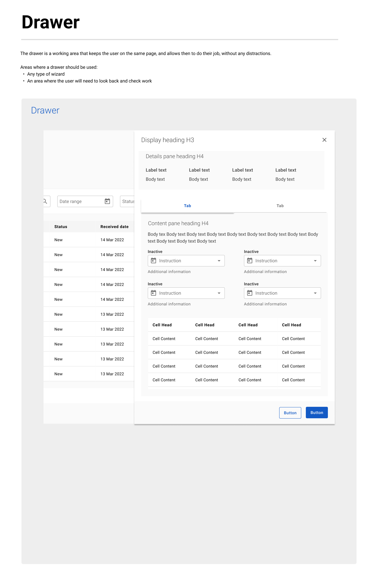
UI Component Library A complete collection of reusable user interface elements such as buttons, input fields, navigation patterns, tables, and alerts. These components are designed to be accessible, responsive, and easily integrated across Bravura products.
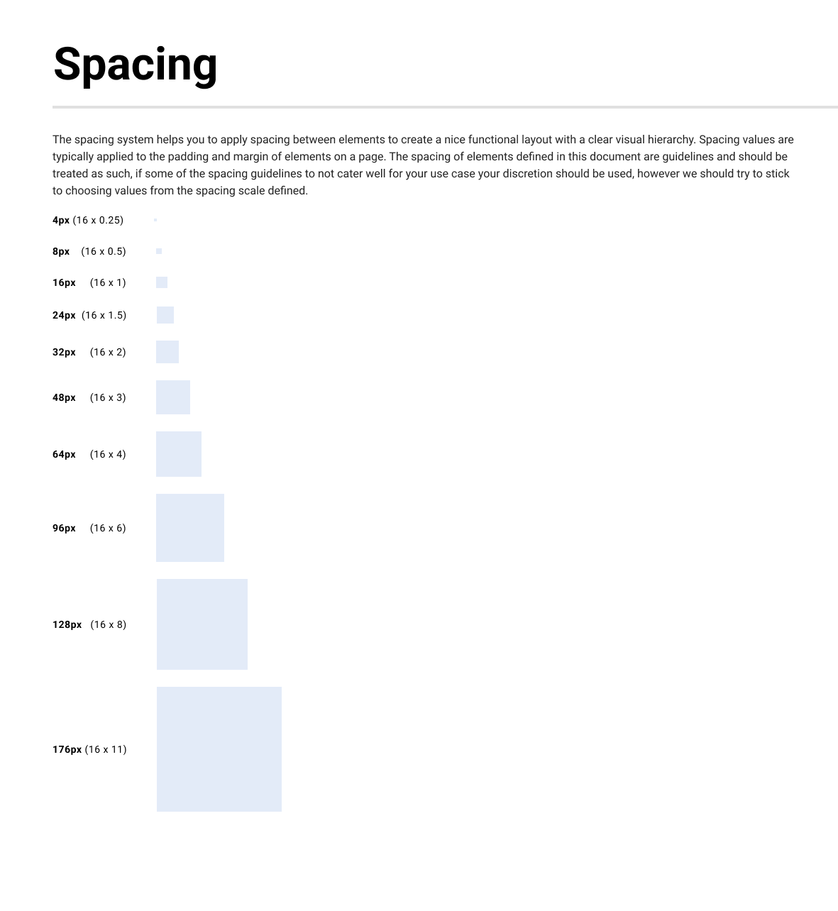
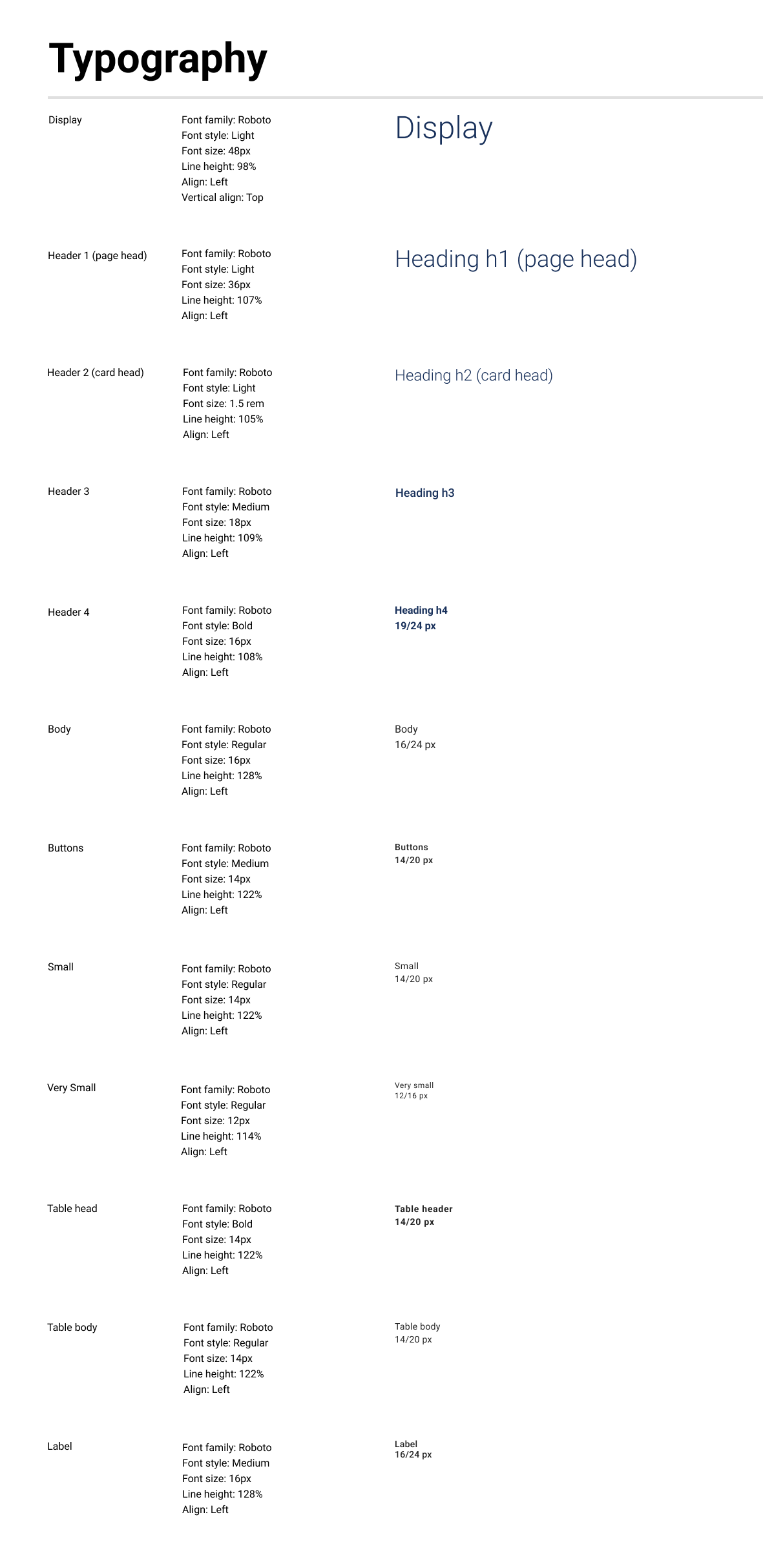
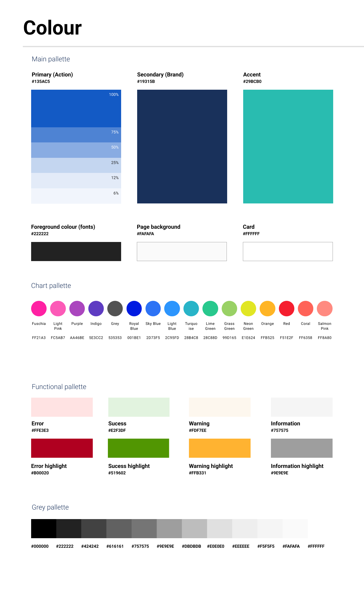
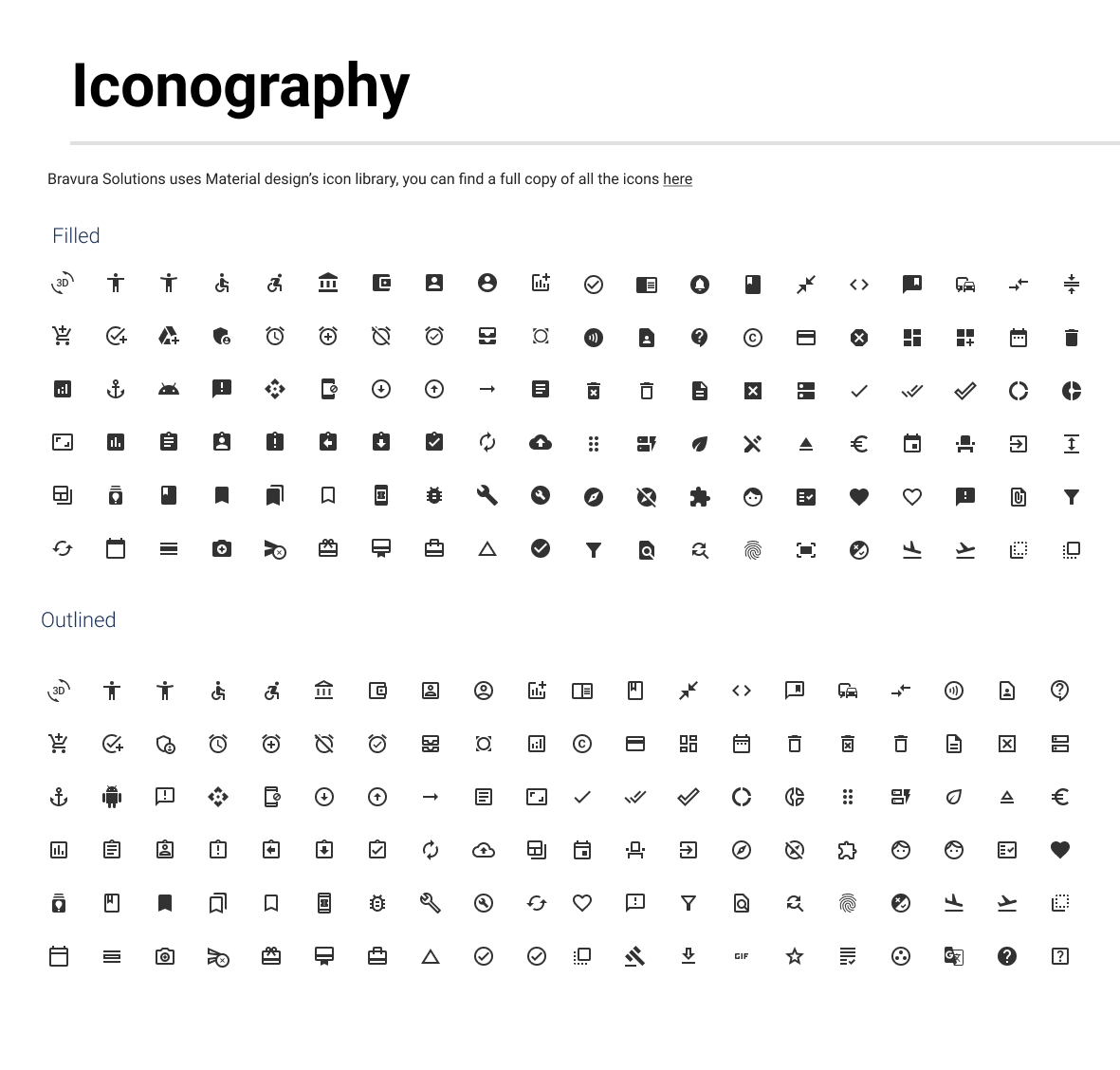
Style Guide The system includes detailed rules for visual design, covering typography, color palettes, spacing, iconography, and layout principles. These guidelines help maintain visual consistency and brand alignment across all interfaces.
Design Tokens The foundation of the system is built on design tokens, which define values such as colors, font sizes, and spacing units. These tokens are platform-agnostic and ensure consistency in implementation across web and mobile environments.
Documentation and Guidelines Each component and style rule is supported by clear documentation. This includes usage guidance, best practices, and code examples to ensure consistent application by both design and engineering teams.
Branding Standards The system includes rules for applying Bravura’s brand identity, including tone of voice, logo usage, and brand colors. This ensures every product reflects the company’s visual and verbal language.
Implementation and Impact
The Bravura Design System was gradually rolled out across all new digital products. Teams adopted the system during new builds and redesigns, which resulted in measurable improvements in design efficiency, quality, and collaboration.
Key Outcomes:
Reduced time spent recreating UI elements across teams
Improved communication between design and development
Faster onboarding for new team members
Enhanced user experience consistency across platforms
The system is now a core part of Bravura’s product development process, supporting both internal efficiency and external brand consistency.